
How To Design A Striking, Yet Functional Home Bar
A gathering place for guests, a successful home bar design should tell a story and evoke a sense of personality. Although designing a space that is stylish and trendy — yet functional and organized — can prove a challenge. We spoke with Chairish designers and architects, who shared their tips and tricks behind crafting a well-designed home bar. We’re discussing everything from finishes and surfaces to location and color palettes; read what the experts had to say here.
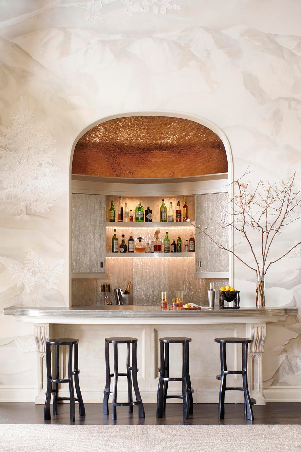
Find the Right Finishes. “A bar is about showing off,” says Wesley Moon. “You could keep your liquor and glasses hidden in a cabinet, but you’ve decided to put them on display. Give guests something to talk about. Pick a cabinet finish that’s a bit unusual or use a stone for the counter that’s rare and special.”
In this space, Moon uses a textured eglomise glass for the upper cabinet doors and backsplash, which are framed by woodwork with a metallic lacquer finish. To add drama, the domed ceiling is covered in gold-leaf mosaic tile.
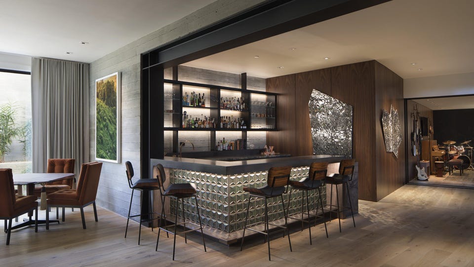
Choose Durable & Attractive Materials. “A bar is a bit like a miniature kitchen, so it needs to stand up to wear,” says Kendall Wilkinson.
“I would recommend using a hard stone surface like quartzite as opposed to marble or limestone,” adds Cindy Witmer. “A bar will be subjected to every kind of abuse from red wine to lemons and limes — the ultimate enemy.”
In this space, Kendall Wilkinson wanted to blend smoothness, texture, and reflection. The bar is created using board-form concrete and beautiful paneling, and the patterned tile creates a dynamic contrast against the wood.
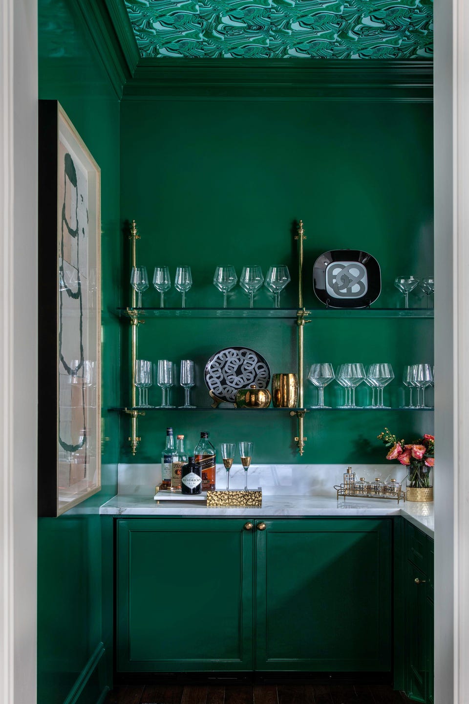
Use Unexpected Accents. “A dark, sexy color palette, brass or lacquered metal accents, an unexpected wallpaper, antique mirrors, and an interesting countertop all play into the way I begin the design,” says Nicole Zarr.
The lacquered green walls, cabinets, and brass hardware in this space blend with the color scheme of the home, but also give the space its own personality.
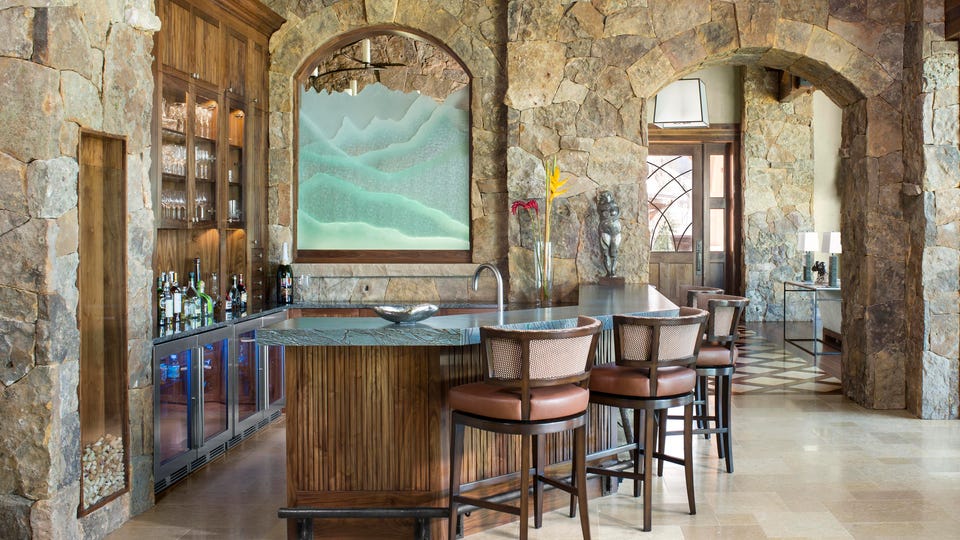
Create a Space with Personality. “Designing a wet bar can be as personal as designing the master bath,” says Kim Toms, managing principal of Slifer Designs. “Often we’ll get a bit more edgy in the wet bar than a kitchen because it’s supposed to be fun, different, and vibrant.”
Location is a key component. “Where in the home do you typically entertain your guests?” asks Toms. “The bar should be easily and centrally accessible from the spaces where your guests typically gather.”
Designed for a client that loves to entertain, this bar incorporates the surrounding mountainous landscape into the finishes.
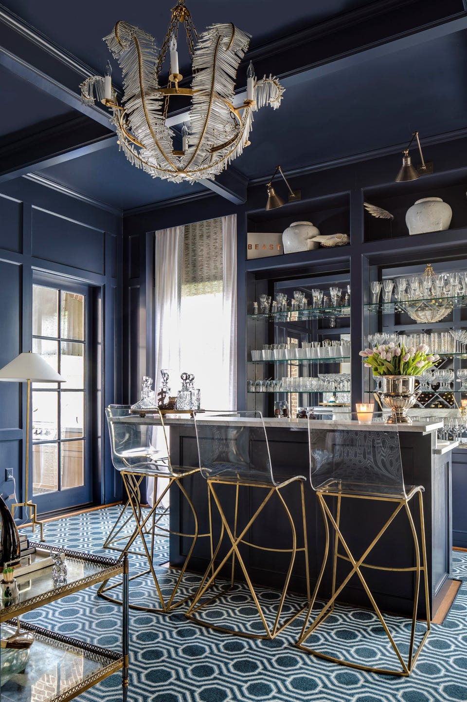
Draw Inspiration from Commercial Design. On a recent trip to London, Cindy Witmer visited the Blue Bar in the Berkeley Hotel. “When I was asked to remodel this room, it was the first thing that came to mind,” she says.
To make the room appear as those it’s a lounge, Witmer chose to paint the room from top to bottom in a high-gloss, navy paint. The high, stand-alone bar creates space for servers in a more formal setting.
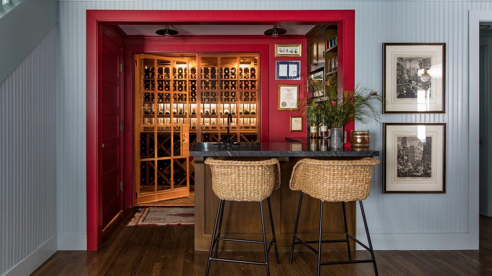
Be Daring. “A basement bar is a perfect opportunity to be bold and daring, and to color outside the lines,” says Tim Barber. “We want guests to see the bar and be energized by thoughts of the fun evening to come.”
Located a few steps above the media room, this space was designed to feel a bit like a snack bar in a 20th-century cinema.
Merge Style with Function. “A well-designed bar should have the necessary shelving, storage, and drinkware to be practical, but these things should be worked into the design in a strategic way,” says Charlotte Lucas. “It’s about masking the functionality with color and pretty details.”
Utilize vertical space. “Most home bars are in small spaces, so it’s crucial to get creative with storage solutions and displays,” Lucas says.
Tucked away in a hallway, this bar boasts a bold color to ensure that it stands out among the surrounding spaces.
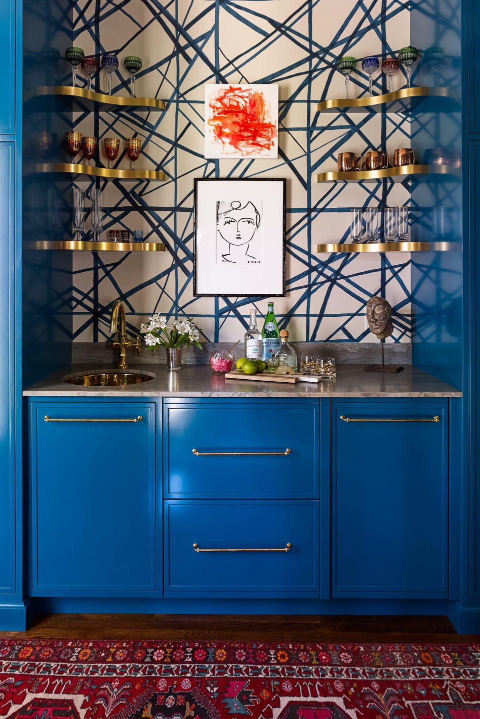
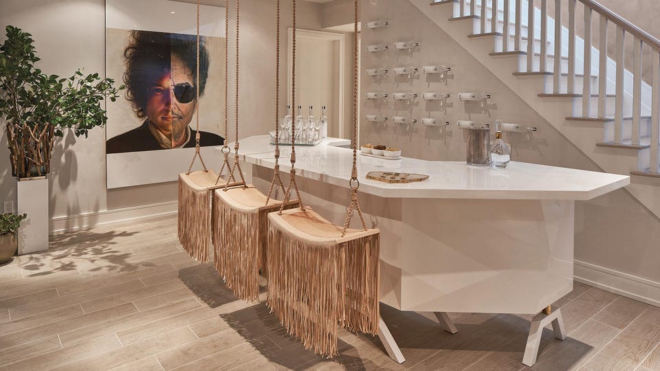
Consider the Space. “What is the home lacking and what is needed to entertain?” asks Laura Michaels. “Consider the room that you may be sacrificing to create the bar, as well as whether there are children living in the home.”
In order to create a space that felt light, Michaels carefully considered the “weight” of each piece in this design. From the hanging swings to the custom bar, everything has been elevated off of the floor. “Keeping the furniture off the floor left more space to move around but also allowed me to use larger pieces,” says Michaels. “The custom bar would have looked too big for the room if it weren’t elevated, lacquered, and cut in an angular design.”
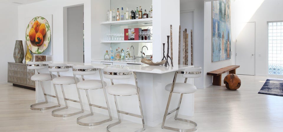
Blend the Design with the Rest of the Home. “Use materials that are appropriate to your color scheme and style, something that will enhance the rest of the room,” says Patricia Bonis. “I like to include an accent material on the inset recessed panels — like a leather or fabric, mirror, or some type of stone, marble, or texture to enhance the surface.”
The soft neutral color palette in this space was inspired by the home’s surrounding views of the ocean and pool.